From:
How much CO₂ does the world emit? Which countries emit the most?

ourworldindata.org
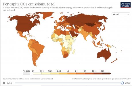
“We can calculate the contribution of the average citizen of each country by dividing its total emissions by its population. This gives us CO2 emissions per capita. In the visualization we see the differences in per capita emissions across the world.
Here we look at production-based emissions – that is, emissions produced within a country’s boundaries without accounting for how goods are traded across the world. In our post on
consumption-based emissions we look at how these figures change when we account for trade. Production figures matter – these are the numbers that are taken into account for climate targets
1 – and thanks to
historical reconstructions they are available for the entire world since the mid 18th century.
There are very large inequalities in per capita emissions across the world.
The world’s largest per capita CO2 emitters are the major
oil producing countries; this is particularly true for those with relatively low
population size. Most are in the Middle East: In 2017 Qatar had the highest emissions at 49 tonnes (t) per person, followed by Trinidad and Tobago (30t); Kuwait (25t); United Arab Emirates (25t); Brunei (24t); Bahrain (23t) and Saudi Arabia (19t).
However, many of the major oil producers have a relatively small population meaning their total
annual emissionsare low. More populous countries with some of the highest per capita emissions – and therefore high
total emissions – are the United States, Australia, and Canada. Australia has an average per capita footprint of 17 tonnes, followed by the US at 16.2 tonnes, and Canada at 15.6 tonnes.
This is more than 3 times higher than the
global average, which in 2017 was 4.8 tonnes per person.
Since there is such a
strong relationship between income and per capita CO2 emissions, we’d expect this to be the case: that countries with high standards of living would have a high carbon footprint. But what becomes clear is that there can be large differences in per capita emissions, even between countries with similar standards of living. Many countries across Europe, for example, have much lower emissions than the US, Canada or Australia.
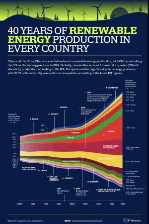
In fact, some European countries have emissions not far from the global average: In 2017 emissions in Portugal are 5.3 tonnes; 5.5t in France; and 5.8t per person in the UK. This is also much lower than some of their neighbours with similar standards of living, such as Germany, the Netherlands, or Belgium. The choice of energy sources plays a key role here: in the UK, Portugal and France, a much higher share of electricity is produced from nuclear and renewable sources – you can explore this electricity mix by country
here. This means a much lower share of electricity is produced from fossil fuels: in 2015,
only 6% of France’s electricity came from fossil fuels, compared to
55% in Germany.
Prosperity is a primary driver of CO2 emissions, but clearly policy and technological choices make a difference.
Many countries in the world still have very low per capita CO2 emissions. In many of the poorest countries in Sub-Saharan Africa – such as Chad, Niger and the Central African Republic – the average footprint is around 0.1 tonnes per year. That’s more than 160 times lower than the USA, Australia and Canada. In just 2.3 days the average American or Australian emits as much as the average Malian or Nigerien in a year.
This inequality in emissions across the world I explored in more detail in my post, ‘
Who emits more than their share of CO2 emissions?’
Carbon dioxide (CO₂) emissions from the burning of fossil fuels for energy and cement production. Land use change is
not included.


