Bumper stickers of Hifivision?

Thanks for sharing some of your ideas. I will share my first thoughts and some very basic ideas and sketches; these are not finals, just some theories and ideas.

CURRENT LOGO

.1717584844150.png
The current logo is actually good. We can see a half-speaker design, and from there, an audio wave or audio signal is going outside. For me, the logo should be very minimal and use one or two colours max to look timeless and modern. So maybe we can convert our current logo into a monochrome or more sleek design. This is my first suggestion.


MY SUGGEESTIONS

For me, "HiFi Vision is a messaging platform about our audio-related doubts." This is the key idea. So I have created some ideas. The colours or finishes are not final, just a representation.

The first one is a vinyl, and we can see a search icon inside that shows the hifi vision mainly for "searching audio-realised things." To improve this logo, we can add audio wave signals like our current logos.

LOGO DRAFT 1.png


SECOND ONE


This is an add-on of different things: an audio note icon and a messaging icon. Also, try to incorporate a hifi into that logo. I need to improvise this idea.

For all logos, I am thinking about some modern font or also thinking about converting hifi vision text into a logo. to develop this soon.
LOGO DRAFT 2.png
 

Attachments

  • LOGO DRAFT 1.png
    LOGO DRAFT 1.png
    31 KB · Views: 8
  • LOGO DRAFT 2.png
    LOGO DRAFT 2.png
    42.2 KB · Views: 5
  • LOGO DRAFT 2.png
    LOGO DRAFT 2.png
    42.2 KB · Views: 5
  • LOGO DRAFT 1.png
    LOGO DRAFT 1.png
    31 KB · Views: 7
We can have posters made out of the audiophile jokes posted in the forum. Posters/vinyl material that can be stuck to the door of our music room or framed posters that can be hung inside the music room. Not sure we can have sound absorbent posters that can serve a dual purpose - decoration as well as room treatment thingy.
 
Outstanding designs are key

Not just good or ok designs….but brilliant, thought provoking, tasteful graphics, and a catchy subtext (if at all) in carefully selected complementary font style. As in our audio quest let’s not settle for mediocre or Chalta Hai ?

The target audience should be Audio enthusiasts like all of us. if this is to work; if we don’t wear/use/display with pride then who will? So …let interested FM decide?

IMO, HFV admin should participate but not insist on having the final say in selecting except if the design is felt to be offensive or demeaning.

And of course encourage and let anyone (Anyone) submit their designs for consideration too.
 
I feel the logo, even without any caption or any narrative text, should immediately scream audio. Someone parked behind us at the lights, should be able to identify that at a 8 feet distance. And the sticker cant cover the entire bumper either. So small but loud and unmistakably audio.
 
Ideally, the mods should bump this thread into a more visible location, to invite maximum response from members.
We have heard you. I've stickied the thread.
Looks like this thread became inactive without final outcome.

Are we still thinking on it ?
Glad that you've revived a moribund thread. Hope it'll generate some traction.
 
View attachment 84757
existing logo looks good, may be some modernisation of the logo and the font should work great
In visual communication there is a process for field testing images before they are used widely. This is to ensure the audience understands and interprets the image accurately. While this image (without the text) is familiar to FM, it needs to be shown to some road users and ask them what they see and understand. We can try it out with our family members to start with.
My wife responded with “Rainbow” and “Eyeball”
 
We have heard you. I've stickied the thread.

Glad that you've revived a moribund thread. Hope it'll generate some traction.
Thanks sir.

We always see people proudly expressing passion on their car using stickers/emblems. Then why not us ? We are big enough global online community.
 
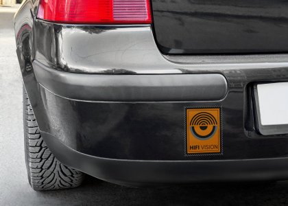
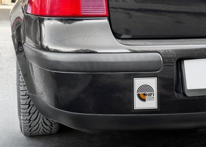
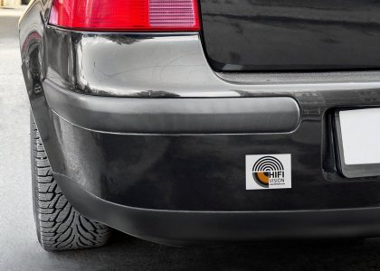
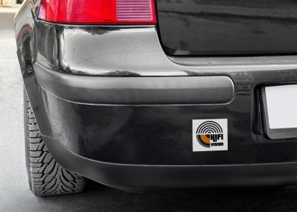
Everyone prefers the current logo, so I have just modified the current logo and created something like this. I didn't have much time this week, and I am not that satisfied with the result. I will work on this again next week and post here. thank you


1.jpg2.jpg3.jpg4.jpg5.jpg6.jpg7.jpg8.jpg9.jpg10.jpg
 
Everyone prefers the current logo, so I have just modified the current logo and created something like this. I didn't have much time this week, and I am not that satisfied with the result. I will work on this again next week and post here. thank you


View attachment 84785View attachment 84786View attachment 84787View attachment 84788View attachment 84789View attachment 84790View attachment 84791View attachment 84792View attachment 84793View attachment 84794
I like the 2nd one
 
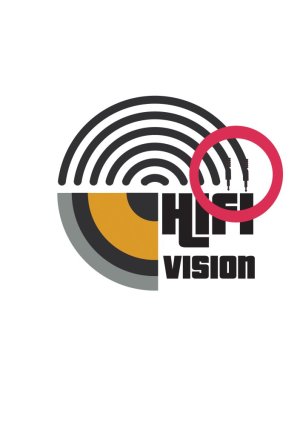
I thought of adding some cable designs. so it can be an audio signal wave or else a cable connecting us to the hi-fi world. theoritically saying. but when I have time, I can work on this.


2.jpg
 
I thought of adding some cable designs. so it can be an audio signal wave or else a cable connecting us to the hi-fi world. theoritically saying. but when I have time, I can work on this.


View attachment 84802
You are on a roll @hifimaddy ! Keep going
A few suggestions for your consideration ( visual cues and imagery associated with music and audio gear
Consider changing the text to Audio or even no text at all if the visual cues are evident even if subtle ? (apple only uses a bitten apple image)
A profile of a speaker driver and cone in the lower right quarter where the text is?
A small silhouette of a head wearing full size headphones (in the yellow bit or over the outer circle?
A few music symbols floating around
The link to hifivision website could be a QR code
 
A profile of a speaker driver and cone in the lower right quarter where the text is?
If that needs to be incorporated then, the two "I" 's of the word "HIFI" can be used as speaker floorstander shape with small cones if the font is bold to incorporate this.
Basically the logo needs to be short, simple, communicative but yet very catchy with retention value.
 
Everyone prefers the current logo, so I have just modified the current logo and created something like this. I didn't have much time this week, and I am not that satisfied with the result. I will work on this again next week and post here. thank you


View attachment 84785View attachment 84786View attachment 84787View attachment 84788View attachment 84789View attachment 84790View attachment 84791View attachment 84792View attachment 84793View attachment 84794
All of them are lovely...you indeed are gifted 😍
 
Everyone prefers the current logo, so I have just modified the current logo and created something like this. I didn't have much time this week, and I am not that satisfied with the result. I will work on this again next week and post here. thank you


View attachment 84785View attachment 84786View attachment 84787View attachment 84788View attachment 84789View attachment 84790View attachment 84791View attachment 84792View attachment 84793View attachment 84794
Among these pics, my vote for the very first pic in this post!
However, I think, for better visual impact and to quickly recognise the audio aspect, that driver with its cabinet might help.
 
Purchase the Audiolab 6000A Integrated Amplifier at a special offer price.
Back
Top